Fourier analysis says that complex patterns can be created by adding up a large number of patterns as simple as sinusoidal waves. To make the idea more concrete, I like to use the following analogy in teaching: Imagine that you lived in the early 19th century. If you wanted to listen to a symphony, the only way to make it happen was to hire a few dozen highly-trained musicians to perform it for you. If you wanted to listen to the symphony anytime you like, and as often as you like, it would have appeared that the only way to realize this luxury was to create mechanical robots that duplicated the virtuosity of the musicians — an inconceivable feat given the technology of the day. But Monsieur Fourier came along and said, “Non non! All you have to do is to create simple devices that buzz at different frequencies. Give me a large number of such simple devices, maybe hundred thousands of them, and I will assign loudness to individual devices in a way so ingenious that when they buzz together, you hear the symphony!” That claim might have sounded crazy, but at least you could see that such an engineering project was conceivable. Of course, it took engineers more than a century to bring the idea to reality, but Fourier’s insight was conceptually crucial.
The same idea also applies to images. Fourier analysis says that you don’t necessarily need Leonardo da Vinci’s masterful control of the brush to paint Mona Lisa. A mediocre, but mathematically gifted, painter who knows nothing more than painting stripes is sufficient for the task. Many people find the idea hard to digest, because, intuitively, superimposing many stripe-y patterns together only leads to plaid-y patterns. To demonstrate that this is not the case, I created the following video to illustrate that the accumulation of weighted Fourier components (sinusoidal gratings) does lead to complex images:
As the video plays, more and more Fourier components are accumulated to reconstruct a 41x41 sampled image of Mona Lisa. The Fourier component that is most recently added to the sequence is displayed on the upper-right side. I programmed the animation so that Fourier components with lower spatial frequencies (i.e., coarser sinusoidal patterns) are added before those with higher spatial frequencies are. You can see that curvy blobs emerge with the superimposition of just a couple of components. A small number of components, about 20~30, are sufficient for creating something vaguely face-like, but it takes a lot more (hundreds) to see Mona Lisa’s elusive smile.
While this animation is useful, my teaching experience suggests that a more embodied experience impresses the students more. I thought about printing Fourier components on transparent papers — one component on one page, so that when the papers are stacked together, Mona Lisa emerges. That would be a dramatic demonstration, but the problem was that after some tests, I realised that a minimum of 200 components were needed for the smile of a 41x41 pixel Mona Lisa to be recognisable. That is the size of a paperback novel. I certainly don’t want to carry such a thick stack of transparencies around. In addition, I also found out that stacking just a dozen of printed components together gave me an object so opaque that light could not penetrate it. This idea was not practical.
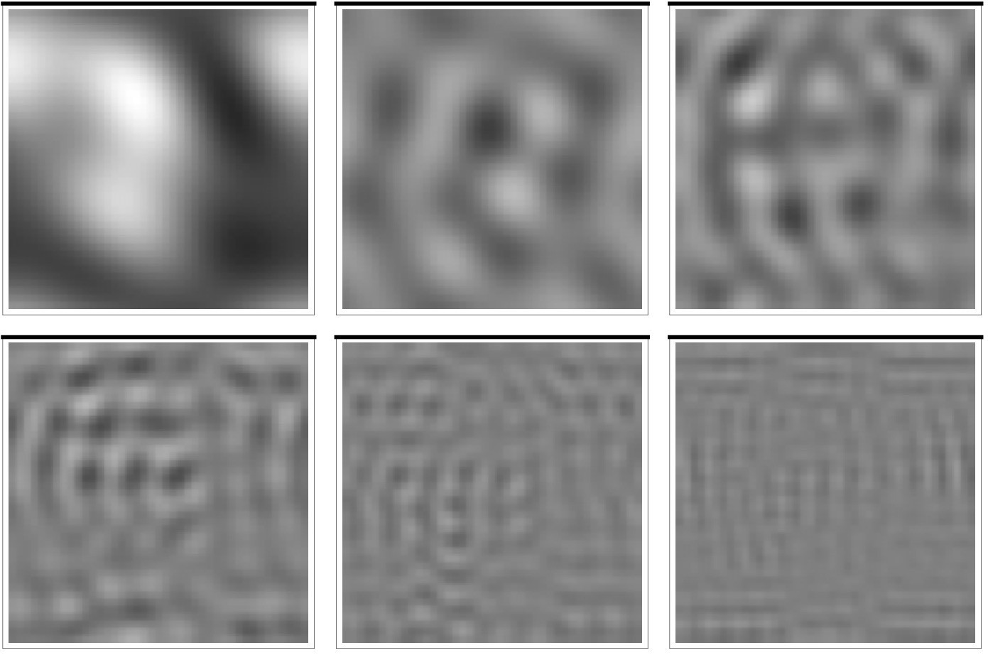
A different approach was needed. I decided to print only 6 patterns, each the superimposition of 20 Fourier components. I printed the 6 patterns on a sheet of translucent tracing paper, and cut them into patches. None of the 6 patches are vaguely face-like:
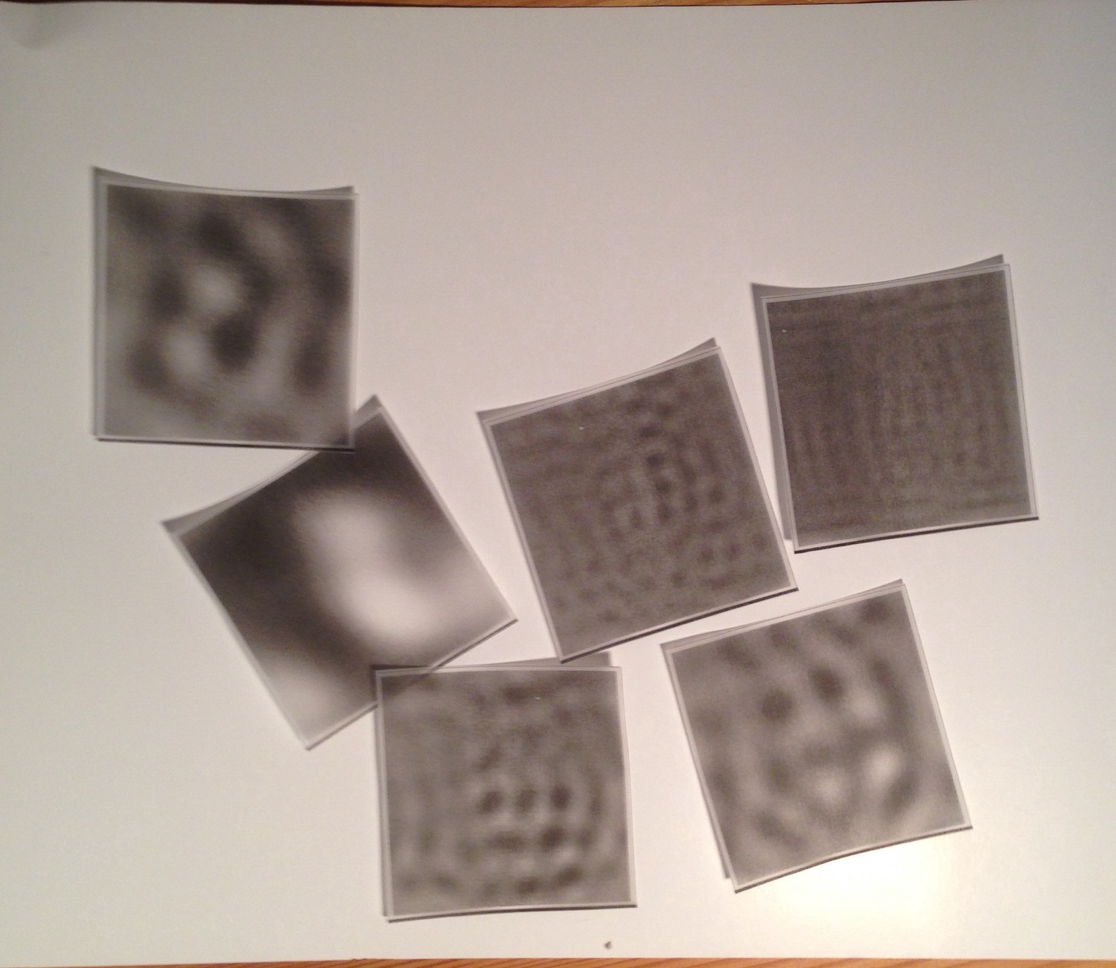
But when they are stacked together, and viewed with a powerful backlight:
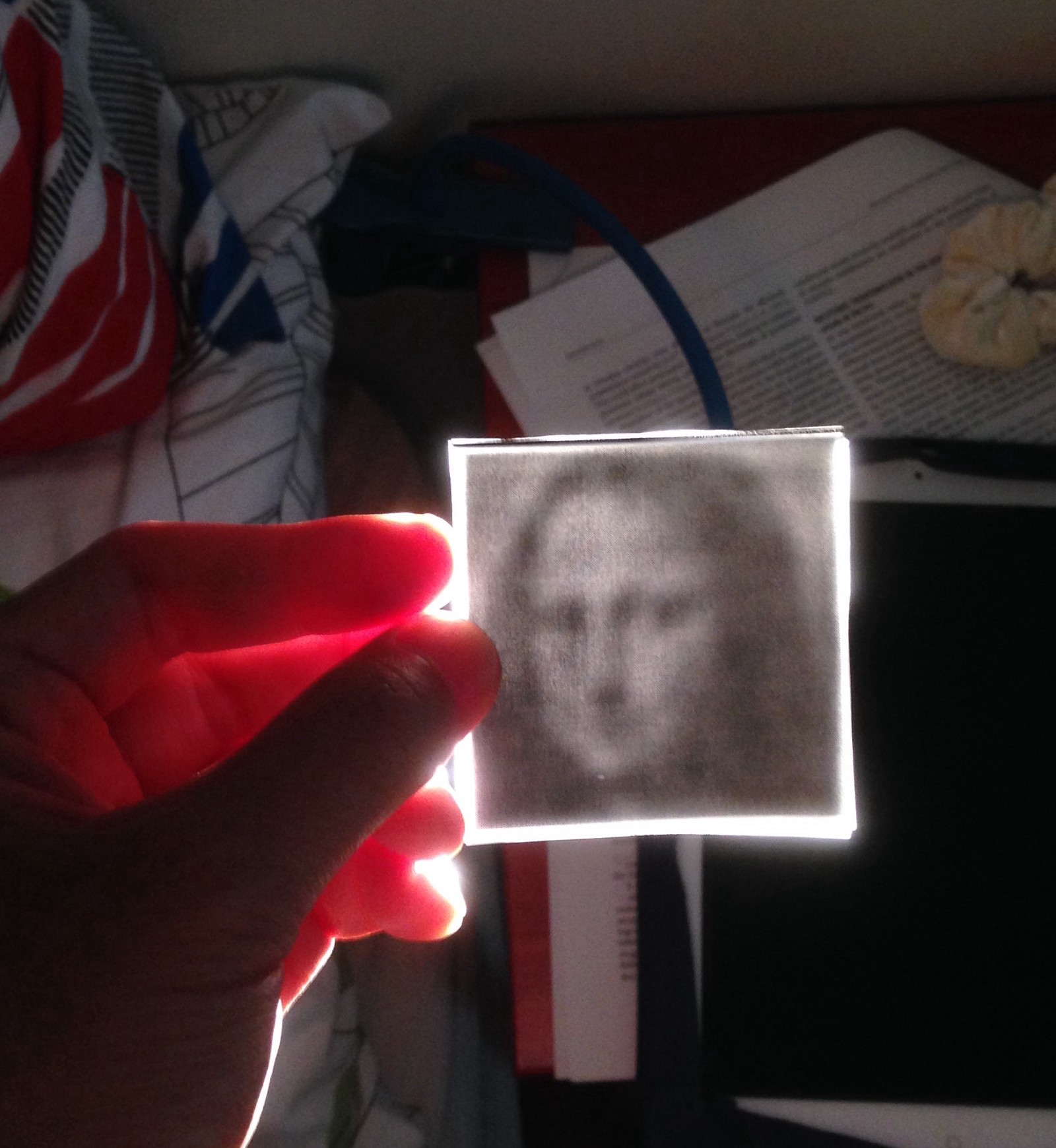
Voila! Miss Mona Lisa!
These are the patterns that I used. You can try them yourself.