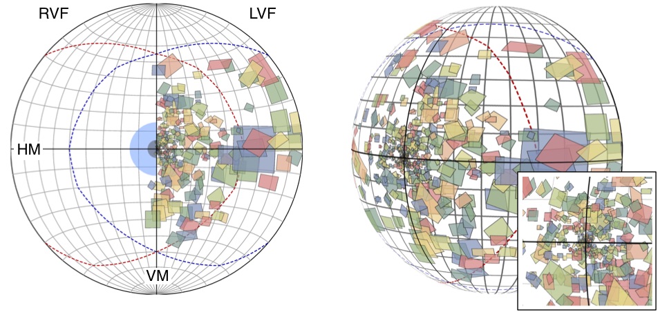
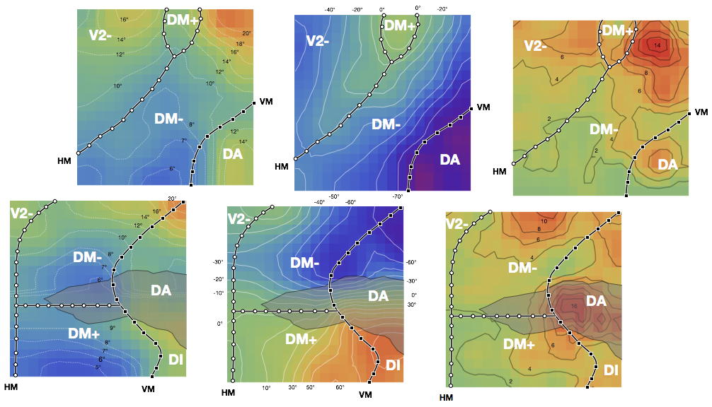
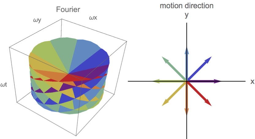
One the things that I enjoy the most in science is to communicate the findings in beautiful figures. I believe scientific figures should be effective (i.e., leave an impression) and efficient (i.e., highlight the main story). Here are some examples of the images that I have created (or helped to create) for research and teaching. Click on the images for brief explanations.


Animations
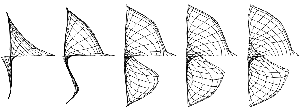
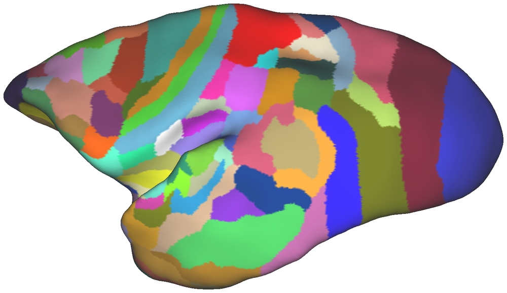
This video illustrates the evolution of a self-organization model of maps in the visual cortex. See this paper.
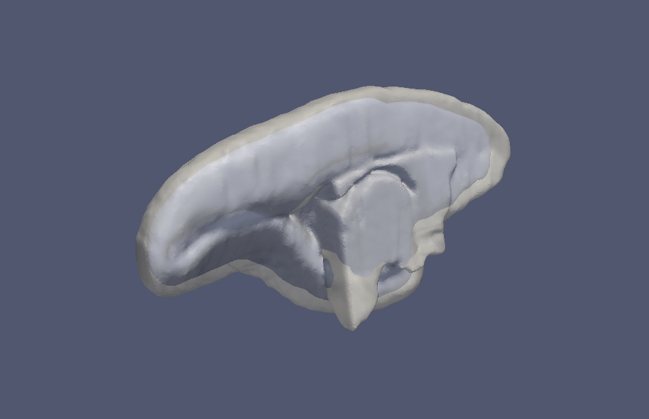
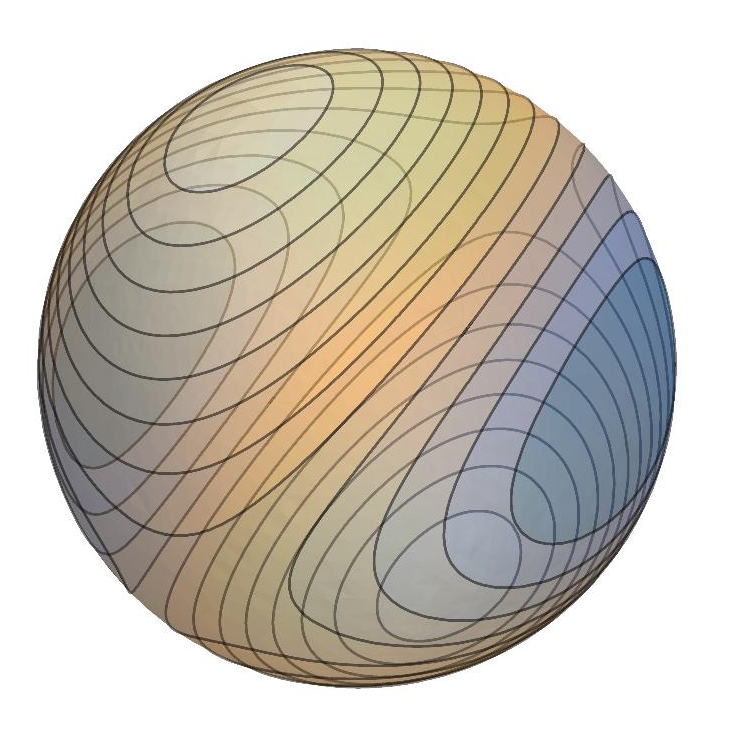
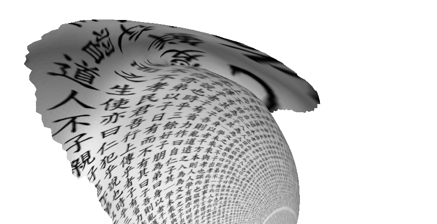
This movie illustrates the evolution of a self-organization model defined on a non-Euclidean surface. See this post.
Fourier analysis says that you don’t necessarily need Leonardo da Vinci’s mastery of the brush to paint Mona Lisa. All that you need is knowing how to paint stripes. This video demonstrates that by adding up Fourier components, you can reconstruct the Mona Lisa. I made this for a lecture in computational neuroscience. See this post.
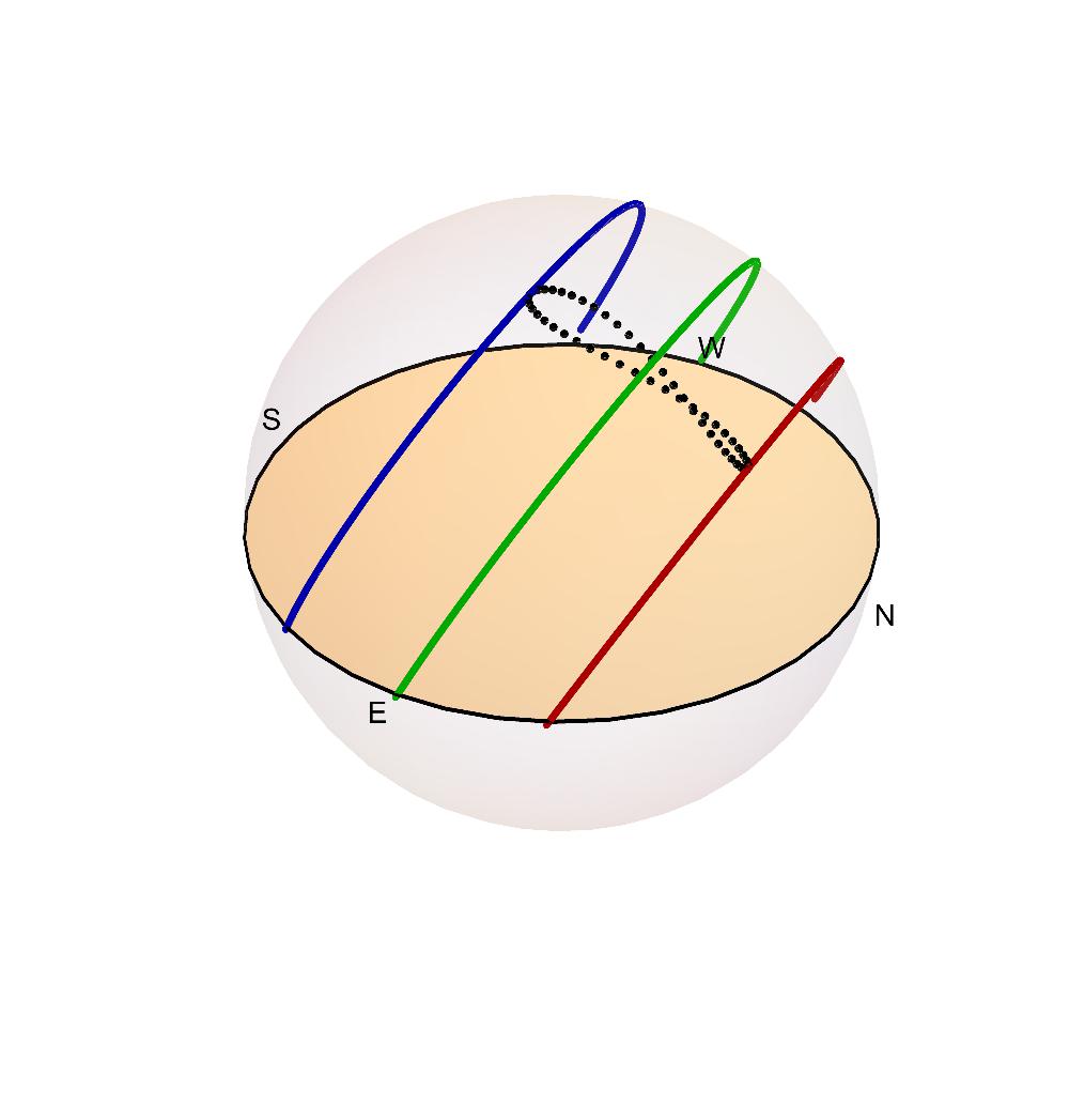
This is a simulation of a sundial installed on the northern wall of the Campus Centre of Monash University (Clayton, Australia). The sundial was designed by mathematician Carl Moppert. To learn more about the sundial, see this post.